_edited.png)

L'Oréal Groupe
Information Architecture Redesign.
Increased user onboarding by
36%
Reduced website abandonment rate by
15%
Simplified website navigation and content
100%
Project Overview
The project goal was to help better facilitate tasks on L'Oréal's website. Intended to be done by condensing the navigational menu content, streamline business related tasks, and restructuring web page content to form a more cohesive structure for learning. It captures the project process to test content and organizational structures to discover and support a new information architecture.
Project Type
Information Architecture Redesign
Duration
11 Weeks | May - June 2023
Tools Used
About the client
L'Oréal leads top cosmetics brands as a parent company, providing confidence boosting beauty products within every niche in the industry. From skincare to hair care to makeup, L’Oréal brands are for every audience. Its website is a hub that hosts information about L’Oréal Groupe’s mission, practices, innovation, and more.
My Role
As a part of the team, I was responsible for creating personas, designing card sorts and wireframing. I was also in-charge of redesigning the entire sitemap as well as carrying out tree tests and chalkmark testing.
What was L’Oréal Groupe lacking?
It is likely that everyday consumers are not intended to be the target users.
Within the main categories, subcategories have long lists of visible sub-subcategories
How did we help L’Oréal Groupe?
Streamlined business related tasks to form a more cohesive navigational structure for the website
Made content concise, allowing the categories for optimization in website use by prioritizing overarching main content.
Recognizing Target Tasks
Since the L’Oréal website is strictly about the business’s information, it is likely everyday consumers are not intended to be the target users. The website’s current content leads visitors to complete one of two actions:
Having business interactions
Business Interactions would consist of actions which help a user conduct business relations or find a job with the company.
Learning about L’Oréal
Learning about the company is integral to presenting a cohesive brand. Users would come to learn more about L’Oréal’s brand statement, history, product lines, social responsibilities, cosmetic innovations, and more.
Personas
The intended targets inherently complete two types of tasks, Business Interactions and Learning about L’Oréal, as the website is for a holding company. The three designed personas show the target goals, which helped us to think about who we are designing for.


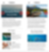
01. Content Inventory
We found that within the main categories, subcategories are further reduced down to sub-subcategories. While all the content holds importance, the many topics clutter the drop down menus when content can be combined.

Describe your image

Describe your image
Describe your image
By creating an inventory, we were able to target repetitive menu items and content that could be combined together.
By either removing redundant items or allowing one to absorb another, we condensed down the categories from 123 to 62.
02. Card Sorts
The goal was to find out how to categorize the remaining content after condensing redundant menu items from our content inventory.
Open Pilot Card Sort was completed by the members of the group, created 14 categories using 62 cards. Although we created 14 categories between the three of us, we were able to condense it down to 7 categories as they had a lot of overlapping cards.
Results
Participants
3
Categories Created
3
Cards
3


03. Sitemapping
The results from Card Sort 2 acted as a base for creating the Sitemap.

Defining Tasks
01. You are a professional makeup artist (MUA) that wants to explore other professional brands to expand your makeup kit. Where would you go to find such brands? (Learning Task)


02. You believe makeup is a great way to express yourself. You feel that working with L'Oréal would be an opportunity to introduce creativity into your work. Where would look to apply for a job with L'Oréal? (Business Interaction Task)


03. Caring for the environment is important to you, and you'd like the products you use to do the same. Where would you go to learn about L'Oréal's commitments to the environment? (Learning Task)

04. Tree Tests
We utilized our Sitemap to structure a Pilot Tree Test.
The two general questions that targeted our two key goals were:
1. You are interested in learning more about the products L'Oréal brands offer. Where would you go to find such products? (Learning Task)
2. You are interested in working at L'Oréal. Where would you go to apply for a job. (Business Interaction Task)

Describe your image

Describe your image
Describe your image
Results
Participants
3
Task 1 Success
100%
Task 2 Success
100%


05. Wireframing
Based on the results from all three tree tests, certain iterations were made to the wireframes in order to achieve maximum user interaction.
Task 1 Wireframe: Business Interaction “Finding Job Openings”
The search bar invites visitors to find specific job openings. It then directs them to a new window of openings.
Original Website

Provides filter/sort options design that is inconvenient and not easy to use.
Does not catch immediate attention
Makes user scroll through all available options
We implemented simple "Sort" and “Filter” pop up menus to allow users to view postings based on the date of posting, if it’s on-site, remote, and more.
While the current website also has filters, these pop up menus allow for the filters to be shown all at once, effecting the openings at the same time instead of individually.
Design recomendations
Users can enter specific job title to see related results so that they dont have to scroll through all the options

To further optimize the search results, we decide to add in specific filter options like job type, area and its department.
To apply for the job postings that best fit their requirements, users can sort job postings based on relevance, dates, and deadlines.
Task 2: Learning about L’Oréal “Eco-friendly Initiatives”
Currently, due to L’Oréal’s current navigational structure of four levels, it takes time to navigate to between them; therefore, learning about content may feel disjointed.
Original Website

Multiple navigational levels lead to site abandonment.
The main change we’ve implemented is simple, but allows for content to be parsed more cohesively.
By adding in a carousel at the top of the page, users can quickly navigate with one between like content instead of needing to sift through four menu levels.
Design recommendations
Users can toggle between pages using these arrows, allowing them to see related content faster.
06. Chalkmark Testing
We aimed to see users’ first assumptions to how a task might work. The task we tested was a Business Interaction: if the user could find where job openings are. In finding job openings, they could then apply to jobs and get hired.
Task prompt: You believe working with L'Oréal would be an opportunity to introduce creativity into your work. Where would look search for job openings?
Although not a direct success, attempting to open the menu would lead to the Job Openings category.
These are direct fails, showing us where people assume interactivity. In a prototype we would make this a clickable link.
Using the search bar, users can search for job openings according to their interest.
Selecting a category from the Discover Departments carousel allows users to view job openings by department.
Findings
Out of 21 participants, 19 successfully completed the task. We included clicks on the search bar, the Department carousel, and the menu icon. 2 participants failed as we did not consider the banner as interactive.
Project Takeaways
Performing a Content Inventory is an important first step in designing a website or application, as it helps to identify the existing content and structure of the site.
Optimal Workshop is a useful tool for performing Card Sorts, Tree Testing, and Chalkmark Testing to analyze user data and identify issues related to navigation.
Renaming and merging categories can also be helpful in improving the ease of user navigation.
Failures are also an integral part of the process. Although they are daunting, learning to identify how we can work towards a solution is important.